Plotting rate experiments
A rate experiment can be constructed directly from a Biologic battery module file or can be generated manually by a set of user specified cell-cycling experiments. In this page we will present scripts that cover different types of situations encountered during routine data-analysis tasks:
Plot a single set of data from a Biologic Battery module file
Plot multiple efficiency series on the same axis for a single experiment
Plot multiple efficiency series on the same axis for multiple experiments
Plot a single set of data from a Biologic Battery module file
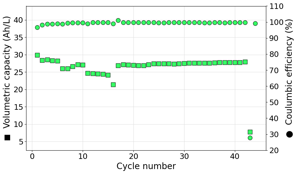
The following script can be used to diectly parse a Biologic battery module file (in .mpt format) to generate an instance of the RateExperiment class. Volumetric capacity and coulombic efficiencies are then plotted on a double y-axis graph. In this case the color of the markers has been set manually to #FF00BB and a transparency of 20% (alpha=0.8) has been set.
import matplotlib.pyplot as plt
from echemsuite.cellcycling.experiments import RateExperiment

# Read the rate experiment data from the Biologic battery module file and set the electorlyte volume
volume = 0.1
experiment = RateExperiment.from_Biologic_battery_module("../utils/biologic_battery_module.mpt")

# Set the color to be used in the plot
color = "#FF00BB"

# Extract the data that needs to be plotted
N = experiment.numbers
Q = experiment.capacity
CE = experiment.coulomb_efficiencies

# Compute on the fly the volumetric capacity in Ah/L starting from the capacity list (in mAh)
VC = [q/(1000*volume) if q is not None else None for q in Q]

# Setup the figure and define a second y-axis
plt.rcParams.update({'font.size': 18})
fig, ax1 = plt.subplots(figsize=(10, 6))
ax2 = ax1.twinx()

# Plot the volumetric capacity on the main axis
ax1.scatter(N, VC, s=100, c=color, marker="s", edgecolors="black", alpha=0.8, zorder=3)
ax1.set_ylabel("◼  Volumetric capacity (Ah/L)", size=20)
ax1.set_ylim((2.5, 44))
ax1.grid(which="major", c="#DDDDDD")
ax1.grid(which="minor", c="#EEEEEE")

# Plot the coulombic efficiency on the secondary axis
ax2.scatter(N, CE, s=100, c=color, marker="o", edgecolors="black", alpha=0.8, zorder=3)
ax2.set_ylabel("●  Coulumbic efficiency (%)", size=20)
ax2.set_ylim((20, 110))

# Set the x-label of the plot
ax1.set_xlabel("Cycle number", size=20)

# Show the plot
plt.tight_layout()
plt.show()
[]
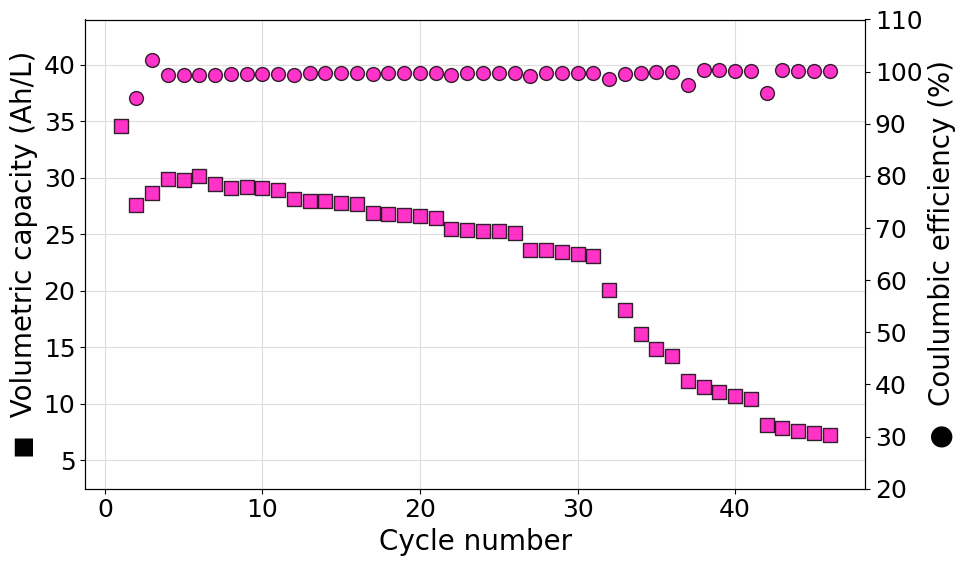
Plot a single set of data from an ARBIN .csv file
The following script can be used to diectly parse an ARBIN .csv file to generate an instance of the RateExperiment class. Volumetric capacity and coulombic efficiencies are then plotted on a double y-axis graph. In this case the color of the markers has been set manually to #03FC3D and a transparency of 20% (alpha=0.8) has been set.
import matplotlib.pyplot as plt
from echemsuite.cellcycling.experiments import RateExperiment

# Read the rate experiment data from the Biologic battery module file and set the electorlyte volume
volume = 0.1
experiment = RateExperiment.from_ARBIN_csv_file("../utils/arbin_sample.CSV")

# Set the color to be used in the plot
color = "#03FC3D"

# Extract the data that needs to be plotted
N = experiment.numbers
Q = experiment.capacity
CE = experiment.coulomb_efficiencies

# Compute on the fly the volumetric capacity in Ah/L starting from the capacity list (in mAh)
VC = [q/(1000*volume) if q is not None else None for q in Q]

# Setup the figure and define a second y-axis
plt.rcParams.update({'font.size': 18})
fig, ax1 = plt.subplots(figsize=(10, 6))
ax2 = ax1.twinx()

# Plot the volumetric capacity on the main axis
ax1.scatter(N, VC, s=100, c=color, marker="s", edgecolors="black", alpha=0.8, zorder=3)
ax1.set_ylabel("◼  Volumetric capacity (Ah/L)", size=20)
ax1.set_ylim((2.5, 44))
ax1.grid(which="major", c="#DDDDDD")
ax1.grid(which="minor", c="#EEEEEE")

# Plot the coulombic efficiency on the secondary axis
ax2.scatter(N, CE, s=100, c=color, marker="o", edgecolors="black", alpha=0.8, zorder=3)
ax2.set_ylabel("●  Coulumbic efficiency (%)", size=20)
ax2.set_ylim((20, 110))

# Set the x-label of the plot
ax1.set_xlabel("Cycle number", size=20)

# Show the plot
plt.tight_layout()
plt.show()
[0.5, 1.0, 1.5, 2.0, 2.5, 1.5]
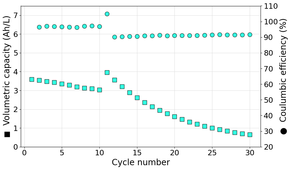
Plot a single set of data from a user defined experiment
The following script can be used to generate a RateExperiment object starting from a set of discrate current steps recorded in separated files. In this case the two current steps are in the format of multiple .DTA files located in different folders. Once loaded in CellCycling format, the data are merged into the final RateExperiment object. Volumetric capacity and coulombic efficiencies are then plotted on a double y-axis graph. In this case the color of the markers has been set manually to #00FFDD and a transparency of 20% (alpha=0.8) has been set.
import matplotlib.pyplot as plt
from echemsuite.cellcycling.cycles import CellCycling
from echemsuite.cellcycling.read_input import quickload_folder
from echemsuite.cellcycling.experiments import RateExperiment

# Manually read the cell-cycling steps recorded, at different currents, in the .DTA files
step_1 = quickload_folder("../utils/gamry_cellcycling/step_0,1A/CHARGE_DISCHARGE", ".DTA")
step_2 = quickload_folder("../utils/gamry_cellcycling/step_0,3A/CHARGE_DISCHARGE", ".DTA")

# Define an experiment from the data just obtained and set the electrolyte volume
experiment = RateExperiment(current_steps=[0.1, 0.3], cellcycling_steps=[step_1, step_2])
volume = 0.1

# Set the color to be used in the plot
color = "#00FFDD"

# Extract the data that needs to be plotted
N = experiment.numbers
Q = experiment.capacity
CE = experiment.coulomb_efficiencies

# Compute on the fly the volumetric capacity in Ah/L starting from the capacity list (in mAh)
VC = [q/(1000*volume) if q is not None else None for q in Q]

# Setup the figure and define a second y-axis
plt.rcParams.update({'font.size': 18})
fig, ax1 = plt.subplots(figsize=(10, 6))
ax2 = ax1.twinx()

# Plot the volumetric capacity on the main axis
ax1.scatter(N, VC, s=100, c=color, marker="s", edgecolors="black", alpha=0.8, zorder=3)
ax1.set_ylabel("◼  Volumetric capacity (Ah/L)", size=20)
ax1.set_ylim((0, 7.5))
ax1.grid(which="major", c="#DDDDDD")
ax1.grid(which="minor", c="#EEEEEE")

# Plot the coulombic efficiency on the secondary axis
ax2.scatter(N, CE, s=100, c=color, marker="o", edgecolors="black", alpha=0.8, zorder=3)
ax2.set_ylabel("●  Coulumbic efficiency (%)", size=20)
ax2.set_ylim((20, 110))

# Set the x-label of the plot
ax1.set_xlabel("Cycle number", size=20)

# Show the plot
plt.tight_layout()
plt.show()
[0.1, 0.3]
Plot a single set of data from a GAMRY folder tree
In the previous example an experiment has been created from a set of .DTA files generated by a GAMRY instrument. That example can, however, be greatly simplified if the data-files are organized in a “standard” GAMRY folder structure. Such a structure is identified as follows:
A
basefoldercontains a set of subfolders associated to different current steps.Each subfolder contains a
CHARGE_DISCHARGEfolder in which all the.DTAfiles are stored.
This is the case for the file structure used in the previous example that is structured as follows:
gamry_cellcycling
    ├── step_0,1A
    │   ├── 0,1A Cycling.DTA
    │   └── CHARGE_DISCHARGE
    │       ├── 0,1A Charge_#10.DTA
    │       ├── ...
    │       └── 0,1A D-Charge_#9.DTA
    └── step_0,3A
        ├── 0,3 Cycling.DTA
        └── CHARGE_DISCHARGE
            ├── 0,3A Charge_#10.DTA
            ├── ...
            └── 0,3A D-Charge_#9.DTA
The gamry_cellcycling represents the basefolder while the step_0,1A and step_0,3A folders represents the folders containin the CHARGE_DISCHARGE data-folders.
This file structure can be easily loaded using the from_GAMRY_folder_tree classmethod of the RateExperiment class. As before the volumetric capacity and coulombic efficiencies are then plotted on a double y-axis graph. In this case the color of the markers has been set manually to #00FFDD and a transparency of 20% (alpha=0.8) has been set.
import matplotlib.pyplot as plt
from echemsuite.cellcycling.cycles import CellCycling
from echemsuite.cellcycling.experiments import RateExperiment

# Define an experiment from the data just obtained and set the electrolyte volume
experiment = RateExperiment.from_GAMRY_folder_tree("../utils/gamry_cellcycling")
volume = 0.1

# Set the color to be used in the plot
color = "#00FFDD"

# Extract the data that needs to be plotted
N = experiment.numbers
Q = experiment.capacity
CE = experiment.coulomb_efficiencies

# Compute on the fly the volumetric capacity in Ah/L starting from the capacity list (in mAh)
VC = [q/(1000*volume) if q is not None else None for q in Q]

# Setup the figure and define a second y-axis
plt.rcParams.update({'font.size': 18})
fig, ax1 = plt.subplots(figsize=(10, 6))
ax2 = ax1.twinx()

# Plot the volumetric capacity on the main axis
ax1.scatter(N, VC, s=100, c=color, marker="s", edgecolors="black", alpha=0.8, zorder=3)
ax1.set_ylabel("◼  Volumetric capacity (Ah/L)", size=20)
ax1.set_ylim((0, 7.5))
ax1.grid(which="major", c="#DDDDDD")
ax1.grid(which="minor", c="#EEEEEE")

# Plot the coulombic efficiency on the secondary axis
ax2.scatter(N, CE, s=100, c=color, marker="o", edgecolors="black", alpha=0.8, zorder=3)
ax2.set_ylabel("●  Coulumbic efficiency (%)", size=20)
ax2.set_ylim((20, 110))

# Set the x-label of the plot
ax1.set_xlabel("Cycle number", size=20)

# Show the plot
plt.tight_layout()
plt.show()
[0.3, 0.1]
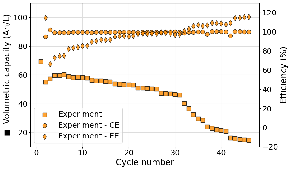
Plot multiple efficiency series on the same axis
Often it can be useful to plot more than one efficiency value on the same axis. This poses a new challenge since the marker used in the plot cannot be easily associated to the data series printed as an axis label. To achieve the desired result a legend should be included merging the data from both axes. An example script, reading data from a Biologic battery module, to do so is reported in what follows:
import matplotlib.pyplot as plt
from echemsuite.cellcycling.experiments import RateExperiment

# Define a Rate experiment (in this case from a Biologic battery module file)
experiment = RateExperiment.from_Biologic_battery_module("../utils/biologic_battery_module.mpt")
volume = 0.05

# Set the color to be used in the plot
color = "#FF8C00"

# Extract the data that needs to be plotted
N = experiment.numbers
Q = experiment.capacity
CE = experiment.coulomb_efficiencies
EE = experiment.energy_efficiencies

# Compute on the fly the volumetric capacity in Ah/L starting from the capacity list (in mAh)
VC = [q/(1000*volume)if q is not None else None for q in Q]

# Setup the figure and define a second y-axis
plt.rcParams.update({'font.size': 18})
fig, ax1 = plt.subplots(figsize=(10, 6))
ax2 = ax1.twinx()

# Plot the volumetric capacity on the main axis
s1=ax1.scatter(N, VC, s=100, c=color, marker="s", edgecolors="black", alpha=0.8, zorder=3, label="Experiment")
ax1.set_ylabel("◼  Volumetric capacity (Ah/L)", size=20)
ax1.set_ylim((10, 110))
ax1.grid(which="major", c="#DDDDDD")
ax1.grid(which="minor", c="#EEEEEE")

# Plot the coulombic and energy efficiencies on the secondary axis
s2=ax2.scatter(N, CE, s=100, c=color, marker="o", edgecolors="black", alpha=0.8, zorder=3, label="Experiment - CE")
s3=ax2.scatter(N,EE, s=100, c=color, marker="d", edgecolors="black", alpha=0.8, zorder=3, label="Experiment - EE")
ax2.set_ylabel("Efficiency (%)", size=20)
ax2.set_ylim((-20, 130))

# Set the x-label of the plot
ax1.set_xlabel("Cycle number", size=20)

# Merge the ledend entries for both axes and print them in the primary axis legend
labs = [l.get_label() for l in  (s1, s2, s3)]
ax1.legend((s1, s2, s3), labs, loc=3)

# Show the plot
plt.tight_layout()
plt.show()
[]
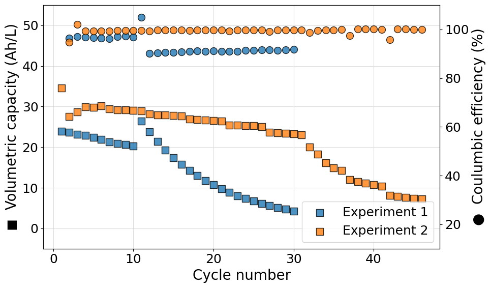
Plot more than one experiment in the same figure
More than one experiment can be plotted on the same figure to compare performances of different cell setups. The following script demonstrates how this can be done. We decided to show the most complex case possible: rate experiments with different origin file formats. The scripts also demonstrate the use of the Palette class to automatically generate a specified color sequence.
import matplotlib.pyplot as plt
from echemsuite.cellcycling.cycles import CellCycling
from echemsuite.cellcycling.experiments import RateExperiment
from echemsuite.graphicaltools import Palette

# Define an experiment from the data just obtained and define a second one using the Biologic battery module file
experiment_1 = RateExperiment.from_GAMRY_folder_tree("../utils/gamry_cellcycling")
experiment_2 = RateExperiment.from_Biologic_battery_module("../utils/biologic_battery_module.mpt")

# Group the experiments in a dictionary and define a volume list for the electrolytes
experiments = {}
experiments["Experiment 1"] = experiment_1
experiments["Experiment 2"] = experiment_2
volumes = [0.015, 0.1]

# Define a color palette to be used in the plot
palette = Palette("matplotlib")

# Setup the figure and define a second y-axis
plt.rcParams.update({'font.size': 18})
fig, ax1 = plt.subplots(figsize=(10, 6))
ax2 = ax1.twinx()

for i, (name, experiment) in enumerate(experiments.items()):

    # Obtain the current color from the palette
    color = palette[i].HEX

    # Extract the data that needs to be plotted
    N = experiment.numbers
    Q = experiment.capacity
    CE = experiment.coulomb_efficiencies

    # Compute on the fly the volumetric capacity in Ah/L starting from the capacity list (in mAh)
    VC = [q/(1000*volumes[i]) for q in Q]

    # Plot the volumetric capacity on the main axis and the coulombic efficiency on the secondary axis
    ax1.scatter(N, VC, s=100, c=color, marker="s", edgecolors="black", alpha=0.8, zorder=3, label=name)
    ax2.scatter(N, CE, s=100, c=color, marker="o", edgecolors="black", alpha=0.8, zorder=3)

# Set axes labels
ax1.set_xlabel("Cycle number", size=20)
ax1.set_ylabel("◼  Volumetric capacity (Ah/L)", size=20)
ax2.set_ylabel("●  Coulumbic efficiency (%)", size=20)

# Set the grid usin the primary axis
ax1.grid(which="major", c="#DDDDDD")
ax1.grid(which="minor", c="#EEEEEE")

# Set the plot range
ax1.set_ylim((-5, 55))
ax2.set_ylim((10, 110))

# Show the legend
ax1.legend(loc=4)

# Show the plot
plt.tight_layout()
plt.show()
[0.3, 0.1]
[]
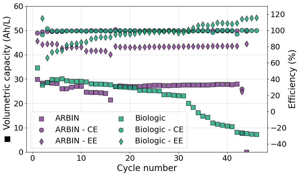
Plot multiple efficiency series on the same axis for multiple experiments
Often it can be useful to plot more than one efficiency value on the same axis for multiple experiments. This poses a new challenge since the marker used in the plot cannot be easily associated to the data series printed as an axis label. To achieve the desired result a legend should be included merging the data from both axes. An example script, reading data from a Biologic battery module, to do so is reported in what follows. Please notice also the use of ncols in the call to legend allowing us to set a two column format of the legend shown.
import matplotlib.pyplot as plt
from echemsuite.cellcycling.experiments import RateExperiment
from echemsuite.graphicaltools import Palette

# Define a Rate experiment (in this case from a Biologic battery module file) and the electrolyte volume
experiments = {}
experiments["ARBIN"] = RateExperiment.from_ARBIN_csv_file("../utils/arbin_sample.CSV")
experiments["Biologic"] = RateExperiment.from_Biologic_battery_module("../utils/biologic_battery_module.mpt")
volume = 0.1

# Create a palette object to easily handle color schemes
palette = Palette("bold")

# Setup the figure and define a second y-axis
plt.rcParams.update({'font.size': 18})
fig, ax1 = plt.subplots(figsize=(10, 6))
ax2 = ax1.twinx()

# Iterate over each experiment and plot the required scatters
scatters = []
for i, (name, experiment) in enumerate(experiments.items()):

    color = palette[i].HEX

    # Extract the data that needs to be plotted
    N = experiment.numbers
    Q = experiment.capacity
    CE = experiment.coulomb_efficiencies
    EE = experiment.energy_efficiencies

    # Compute on the fly the volumetric capacity in Ah/L starting from the capacity list (in mAh)
    VC = [q/(1000*volume)if q is not None else None for q in Q]

    # Plot the volumetric capacity on the main axis
    s1=ax1.scatter(N, VC, s=100, c=color, marker="s", edgecolors="black", alpha=0.8, zorder=3, label=f"{name}")

    # Plot the coulombic and energy efficiencies on the secondary axis
    s2=ax2.scatter(N, CE, s=100, c=color, marker="o", edgecolors="black", alpha=0.8, zorder=3, label=f"{name} - CE")
    s3=ax2.scatter(N,EE, s=100, c=color, marker="d", edgecolors="black", alpha=0.8, zorder=3, label=f"{name} - EE")

    # Append all the scatters to the scatters list
    scatters.append(s1)
    scatters.append(s2)
    scatters.append(s3)

# Apply settings to the main y-axis
ax1.set_ylabel("◼  Volumetric capacity (Ah/L)", size=20)
ax1.set_ylim((0, 60))
ax1.grid(which="major", c="#DDDDDD")
ax1.grid(which="minor", c="#EEEEEE")

# Apply settings to the secondary y-axis
ax2.set_ylabel("Efficiency (%)", size=20)
ax2.set_ylim((-50, 130))

# Set the x-label of the plot
ax1.set_xlabel("Cycle number", size=20)

# Show the plot
labs = [l.get_label() for l in  scatters]
ax1.legend(scatters, labs, loc=3, ncol=2)

plt.tight_layout()
plt.show()
[0.5, 1.0, 1.5, 2.0, 2.5, 1.5]
[]